
8 ways to get your product pages primed for the holidays
As an online merchant, you know that product pages are important. You might even go so far as to say they’re the most important part of your store. After all, they’re where customers make the all-important decision to buy or not buy, right?
And yet, as anyone who shops online can surely attest, there are a lot of crummy product pages out there. Whether they’re missing key purchasing information (How much does this thing cost?!) or rife with usability challenges (Where’s the dang cart?!), you don’t have to look hard to find examples of product pages that aren’t converting as well as they could.
To ensure your product pages aren’t costing you potential sales over the holidays, today we’re covering eight ways to improve them without overhauling your site. Black Friday is this coming Friday, so you're going to have to hustle if you want your efforts to pay off. Lucky for you, we've included some great apps, examples, and recommendations in this post to help you get your product pages looking their holiday best just in time.
Go all in on product photography
Would you buy something based on a hazy 100px thumbnail image? No? Well, chances are, neither would your customers.
People like to see before they buy, and having big, detailed product images is one of the best ways to build confidence and make customers feel good about what they’re buying. As Smashing Magazine puts it, “the softer, tastier, flashier and more attractive your products look to shoppers, the more confident they’ll feel about purchasing from you and the better your conversion rate will be.”
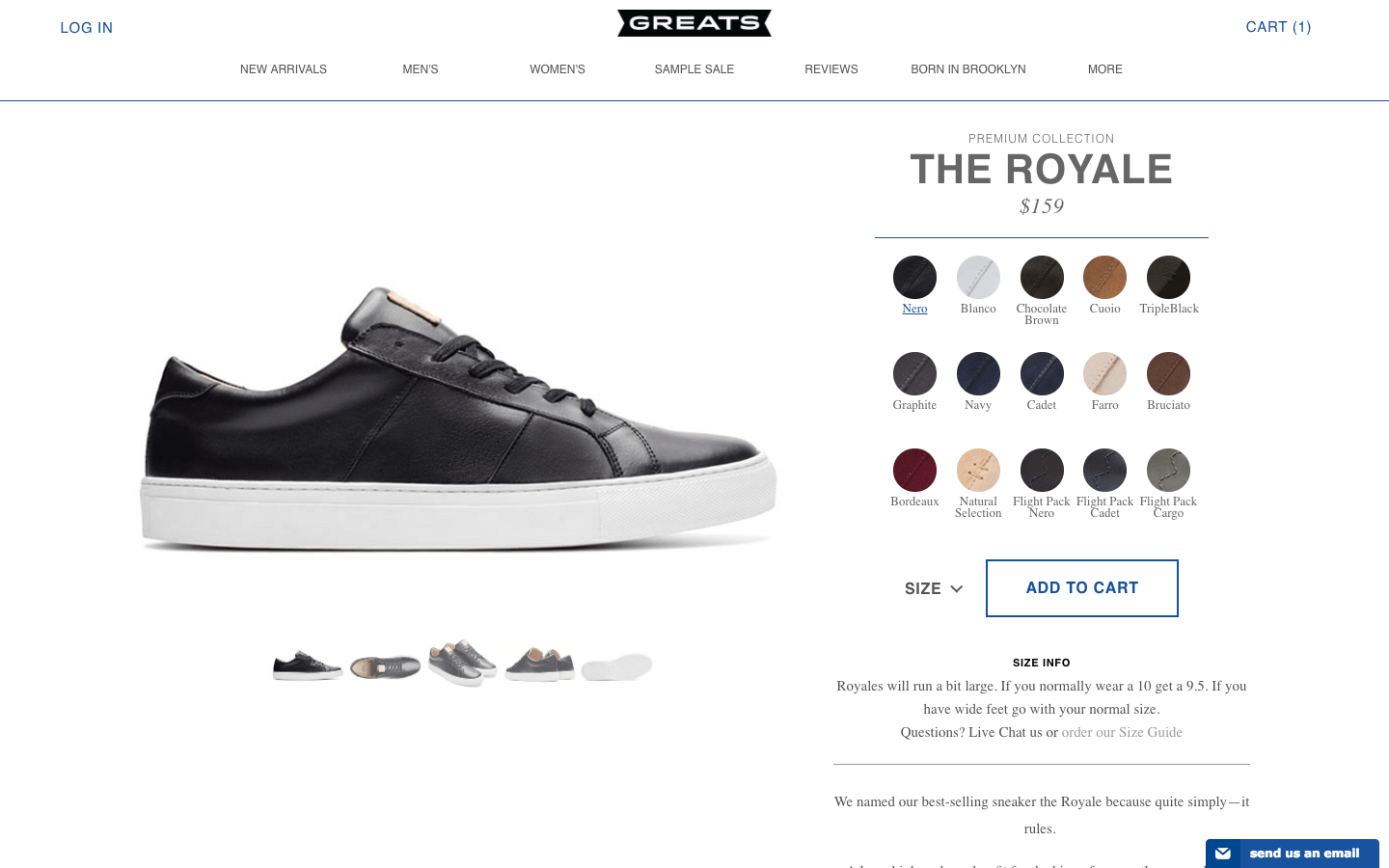
For a look at some great product photographer, check out sneaker brand GREATS. The super high-res images and detail shots give a sense of the texture and craftsmanship of their products, while the editorial “lifestyle” photos give context by letting customers put themselves in the models' shoes. (GREATS also features a "How to Wear" image carousel and an Instagram feed showing customers wearing their shoes IRL.)
Add a video
If you want customers to see all the angles of your product, video may be the answer. No longer just an “up-and-coming” marketing tactic reserved for cutting-edge tech and electronics companies, video has become a popular way to showcase products, explain their value, and build relationships with customers and prospects.
It’s also been shown to be tremendously effective. According to one retailer’s tests, a visitor who watches a video of a product is 114% more inclined to add that product to their cart. According to another test, customers who watch a product video prior to purchasing have average order values 50% higher than those who don’t.
Many merchants think that creating videos is expensive and time-consuming, and they're not entirely wrong. But here’s the thing: you don’t have to create a feature-length film for every single product in your catalogue. Videos work best for products that need a bit of explanation to be understood—products like the Glif from Studio Neat.
This video might look fancy, but it’s really quite simple: stop-motion animation with some clever editing and overlays that could easily be accomplished with a smartphone and a free app. It’s also short—just 59 seconds—which is perfect for time-crunched holiday shoppers. Keep videos short, simple, to-the-point, and you’ll win new customers, hold onto existing ones, and improve consumer confidence overall.
Inject some creativity into your sales copy
Copy is an underrated component of the product page—the standard approach being to simply copy and paste the manufacturer’s description verbatim. Besides costing you from an SEO standpoint, pre-fab copy does nothing to distinguish your site from your competitors, and nine times out of 10, it’s about as readable as an owner’s manual. Don’t do it!
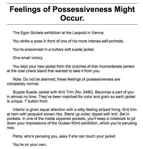
Instead, take a page from the J. Peterman Company and put your own spin on things. The descriptions that accompany their vintage-inspired clothing are original, evocative, and on-brand. Here's an example from the product page for their Supple Suede Jacket:
You don’t have to create copy of that exact calibre or length. According to web designer and conversion specialist David Crowther, long copy works best when your product is expensive, complex, or unsought (as the J. Peterman Company arguably is). On the other hand, short copy tends to work when your product is simple, inexpensive, or highly sought-after.
Whichever approach you take, make sure the copy you put on each page is original, error-free, and working hard to help your potential customer.
Capitalize on user-generated content
Unless you’re a trusted household name, visitors often need a bit of reassurance before buying from you. One of the best ways of providing that is with user-generated content (UGC).
According to a BrightLocal survey, 88% of consumers put as much stock in online reviews as personal recommendations—which is a bit surprising, given that most online reviews are posted by total strangers. The same survey found that only 12% of the population does not regularly read reviews for products before purchasing.
With stats like that, it’s not surprising that so many businesses are building UCG into their product pages. But just installing an automated review system like Yotpo or Trustpilot isn’t your only option. Look at how Rent the Runway uses UCG to help quell anxiety about the idea of renting special occasion clothing.

Not only are customers rating the garment, they’re uploading photos of themselves wearing it, providing detailed size and fit information, and even recommending undergarments to wear with it. Authenticity is huge in marketing, and having real people share their experiences makes what could easily come off as propaganda seem organic, honest and relatable.
Display delivery and returns information
Did you know that the number-one cause of cart abandonment is hidden delivery costs at checkout? Or that 1 in 4 online shoppers stop short of buying because of a lack of definitive delivery data?
The fix is simple: make sure your shipping costs and options are displayed as early and as prominently as possible—like on your product pages!
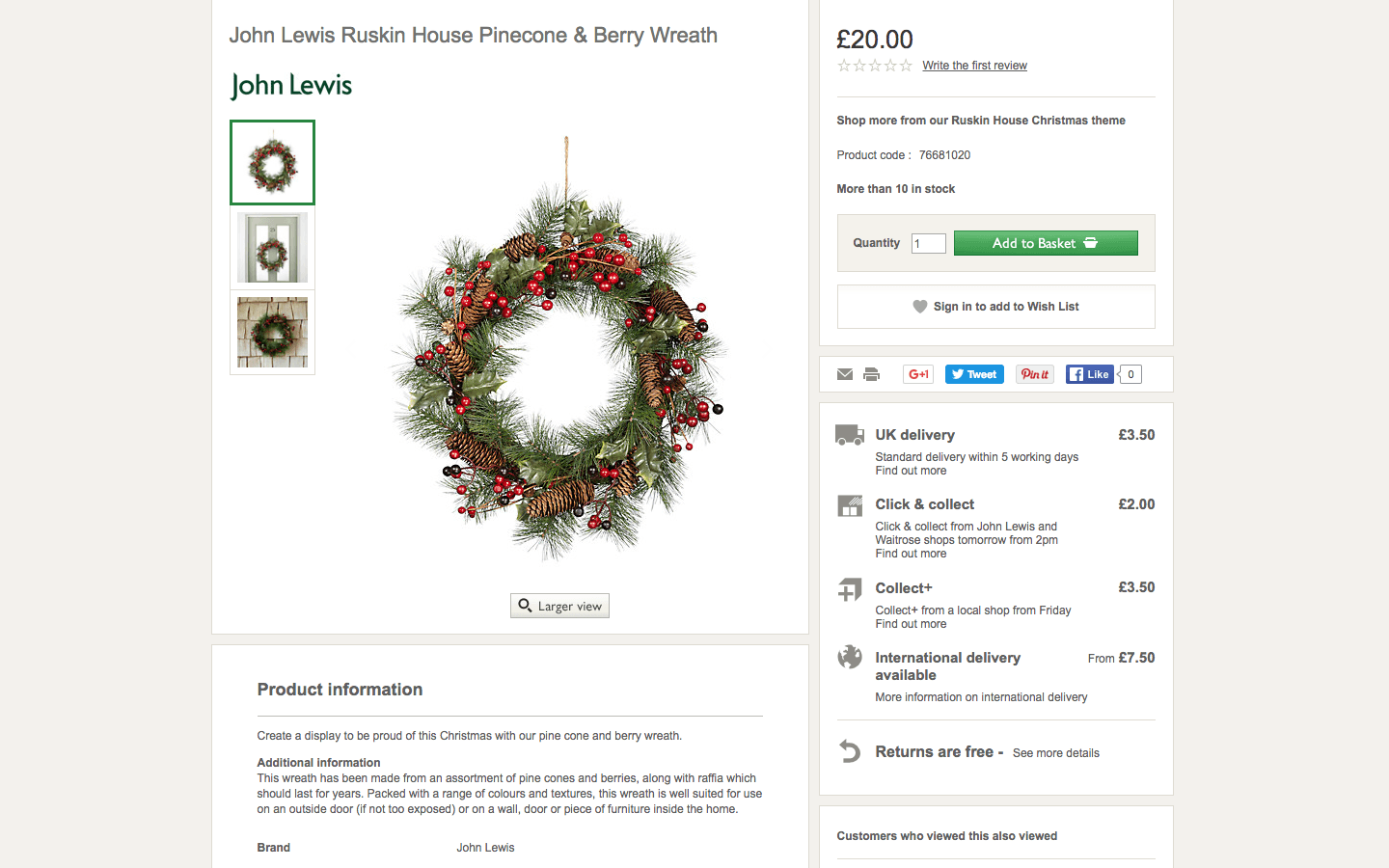
British department store John Lewis does an excellent job of this, clearly outlining multiple delivery options via a neat sidebar. The information has been summarized to save space—you have to click for more information on international delivery—but it’s right there throughout the entire process. They’ve also highlighted their free returns policy, something that has shown to play a central role in shoppers’ decision to buy.
Add a wishlist or "save for later" button
Remember the days when you'd sit at your kitchen table and pen a letter to Santa, telling him exactly what you wanted for Christmas? Well, things are a little more direct and high-tech now. An ecommerce wishlist is exactly what it sounds like. Users can add your products to a list, then share the link with family members or their entire social network. Ideally, at least a handful of people—including some who have never visited your store before—will view the list and purchase one or more item. It's easy for the gifter, satisfying for the receiver, and lucrative for you.
For years, women's fashion brand ModCloth has been using the wishlist feature to great effect. Besides allowing shoppers to create and share lists, they use them to personalize their email marketing campaigns, notifying customers when items on their wishlist are low in stock or on sale. The wishlist feature also helps ModCloth measure demographic interest in a product, letting them tailor their future product offerings.
Incentivize social sharing
By now, you’re probably used to seeing social sharing buttons on product pages (and blog posts and landing pages and emails). Given that everyone and their dog uses social media these days—and the fact that it’s proven to be one of the best ecommerce sales drivers out there—adding them to your product pages is probably a good idea.
However, cashing in on social commerce isn’t as easy as adding a few "Share this!" buttons and calling it a day. Visitors need a reason to share your content, and it’s up to you to give it to them.
Vintage Teaworks does a great job of this by offering a 10% discount to anyone who shares their products on one of many supported networks (notice how the four most popular are displayed on the page, while the rest expand when clicked—a nice way of keeping things clean and uncluttered).
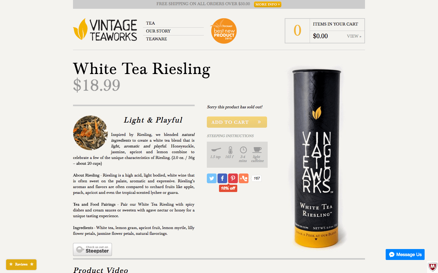
They’ve also opted to display the number of likes and shares for each product, and in doing so offer positive reinforcement for other visitors to follow suit. On the flip side, including share buttons with low numbers of shares and likes can actually lead to what Lemonstand calls “negative social proof,” making it seem like the products are low-quality or the site is untrustworthy.
If you’re going to use social buttons, make sure they’re connected to the networks where your customers are most active, and that they’re not distracting from what really matters—purchasing.
Create a comprehensive FAQ section
No matter how thorough and polished your product descriptions, customers are going to have questions. And unless you want to spend all your time answering the same three questions (When will you ship my order? What's your return policy? It's December 23rd and my package hasn't arrived—HELP!) you should probably create an FAQ section either on your product pages or linked from them.
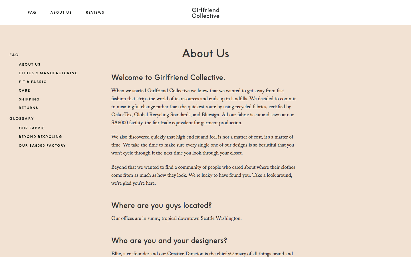
Maybe we're stating the obvious here, but the purpose of an FAQ section is to address frequently asked questions about your business and products. What's less obvious is that it serves a whole bunch of other functions as well, from saving time to alleviating purchaser anxiety to building your brand. Ethical activewear brand Girlfriend Collective does all that and more with their super comprehensive, ultra navigable FAQ page.
As Shopify says, "The FAQ section deals with the specifics. It's the go-to destination for finding answers to specific questions about your product or business operation." The more granular you can get with your answers, the fewer questions you'll field, and the better equipped you'll be to answer them.
Wrapping up
The product page is the moment of truth for your customer: it's where they make the decision to buy or bounce. As an online merchant, it's up to you to create an experience that is informative, navigable, personal, and even fun. By putting some of the tips in this post into practice, you should be able to do just that, improving the purchasing experience for your customers and increasing the profitability of your store.
We’d love to hear more about your experience when it comes to optimizing product pages. What strategies and tools do you employ? Have they paid off? Let us know in the comments below!