6 tips to help you create great ecommerce marketing emails
As you may have noticed when you opened your inbox this morning, email marketing is alive and well, and for online merchants, it’s actually one of the most profitable marketing channels available. Don’t believe us? Consider the following:
- Email is nearly 40 times more effective at acquiring new customers than Facebook and Twitter combined.
- 66 percent of online consumers have completed a purchase as a result of a marketing email.
- Emails prompt purchases at three times the rate of social media, while average order values are 17 percent higher.
In other words, if your online store isn’t consistently engaging customers through email, you’re leaving money on the table—never mind an opportunity to boost site traffic, build customer relationships, and access rich, actionable data.
So how do you get in on the benefits of email marketing? While it’s easy enough to slap together a bare-bones, plain-text email (and don’t get us wrong, those can be super effective), when you only have a split-second to get a reader’s attention, sometimes you need more than a white page with a splash of Helvetica.
That’s where today's post comes in—helping you craft creative and conversion-focused emails for your store. Whether your aim is to attract new customers, retain existing ones, or just keep purchasers up-to-date with the status of their orders, beautiful, responsive email is the way to do it... naysayers be damned.
Collect emails in your store with a popup
While some people might consider popups annoying, when they're used strategically, they can be the cornerstone to growing your newsletter subscriber list. Before you start overhauling your email marketing strategy, first create an email collection popup in your store. This will ensure that while you're busy redesigning templates, choosing fonts, and finding images, you'll still keep building your audience.
There are some great Shopify apps (including Pixel Union's Pixelpop) that will help you achieve this. When designing your email collection popup, ensure it doesn't clash with your store's branding, but also doesn't blend into the background.

Notice how Province of Canada uses Pixelpop effectively in their store. The coral background of the popup is eye-catching and ties in with their logo in the header. Pixelpop is customizable and comes with a variety of fun, seasonal templates.
Depending on what you're offering through your popup (discounts like the one shown above work great), you'll want your popup to appear at the right moment. If you do decide to offer a discount, offer it within the first few moments of a visit to entice potential customers to convert using their newfound discount. If you're wanting your blog readers to subscribe to get new blog posts sent to their inbox, consider displaying your popup at the end of a blog post.
And now that you're ready to start collecting emails, it's time to take a look at creating emails!
Keep your call to action clear, big, and high up
Pay close attention to the placement of your call to action (CTA), remembering that most people will see only the “above the fold” portion of your message before deciding whether or not scrolling down is worth the effort. This is extra-important when designing for mobile users who may see as little as 600 vertical pixels.
It’s also important that your CTA looks like a CTA. Generally, this means some form of button that is large enough to tap on a touch screen (44 x 44 pixels, according to Apple guidelines) padded with plenty of white space. Make sure it stands out against the background, and that it looks clickable, whether you do that with iconography, a hover state, or simple and instructive copy.
In addition to placing a CTA high up, it’s also a good idea to repeat it for subscribers who have taken the time to read (or skim) through your entire email. A quick reiteration of the main CTA at the bottom of your email can be very effective when it comes to capturing the elusive email click-through.
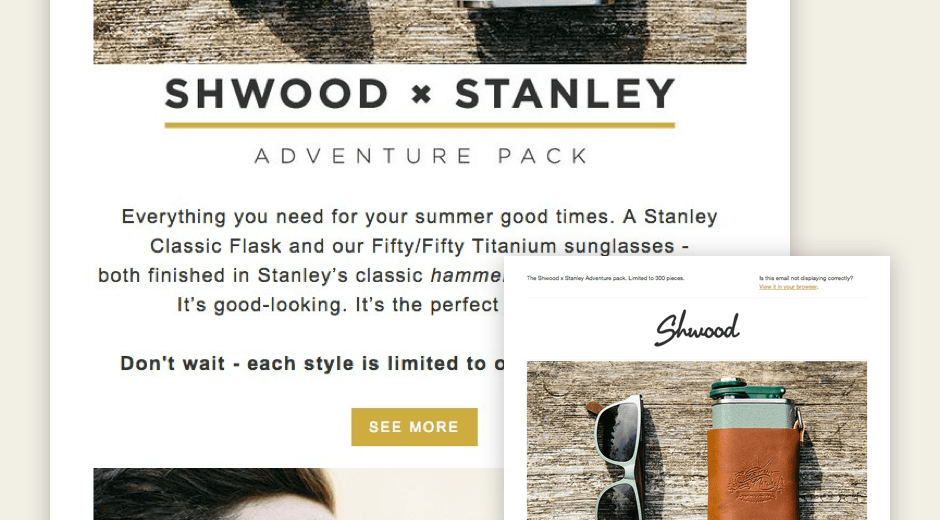
Here’s an example of eyewear company Shwood nailing it in a product announcement email (click the image to view the entire email):

Use compelling images (but don’t rely on them to carry your message)
Text is great and all, but sometimes it can’t tell a story quite like an image can—especially when that story is about a beautiful new product. Evocative images help draw the reader in and break up larger sections of text, plus they can have a direct positive impact on conversions.
However, that doesn’t mean your emails should be entirely, or even mostly, comprised of images. Many email clients by default are set to “images-off," meaning that unless the recipient opts to load them, the beautiful images you’ve shot, edited, and uploaded may never be seen.
For this reason, many experts recommend planning for no images, making the main “hook” of an email textual rather than graphical. Avoid embedding critical information in images, or at the very least reinforce them with alt-tags that will display even when the images don’t.
Here’s an example from PayPal that gets images right, but doesn’t depend on them to convey the highly relatable benefit of using their service.

Use large, readable fonts and typefaces
If you can’t count on images to communicate your message, aesthetically pleasing typography might just be the next best thing. We’re not talking about zany or embellished custom fonts (to go that route, you’d likely have to embed it within an image), we’re talking about artfully combining basic, cross-platform fonts like Arial, Helvetica, Georgia and Courier.
While many lament the limitations of email HTML—interactive elements like Flash and JavaScript are incompatible with most email clients, along with custom fonts, wide layouts, and background images—they can actually be a blessing in disguise. For one thing, by opting to use a bunch of custom-font headlines and displaying them as images, you'll increase the probability of spam filters flagging your campaign. On the flip side, by opting to use only basic, cross-platform fonts, you'll keep things super simple and readable—a kindness to both the reader and their bandwidth.
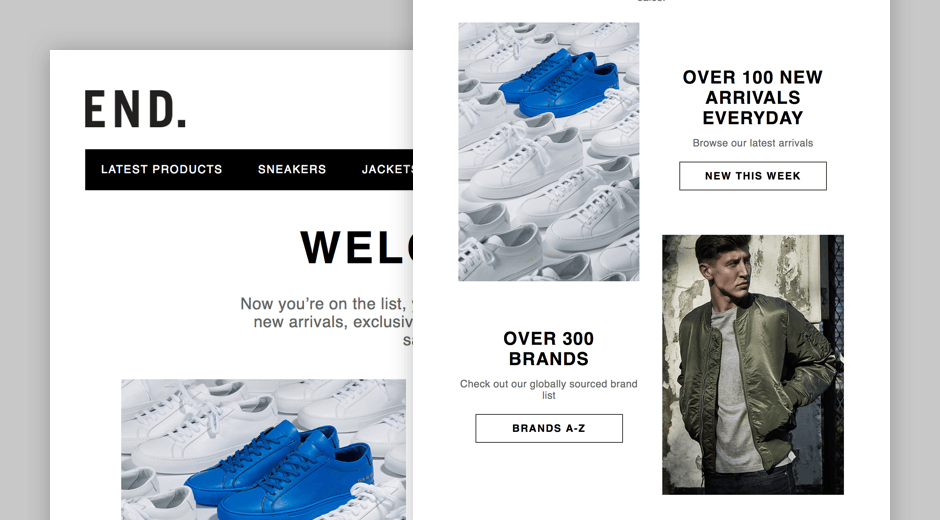
Here’s an eye-catching welcome email brought to you by men’s clothier END., created with the always reliable Helvetica-Neue.

When it comes to copy, keep it concise
In this age of infinite distraction, brevity is key. Readers aren’t going to stay with your email for more than a minute or two, and when it comes down to it, you don’t really want them to. You want them to click a link or take a survey or buy a product—anything that will move them from passively skimming your email to actively engaging with your brand.
As GreenPal CEO Bryan Clayton lays out in this blog post, one of the biggest mistakes merchants make is trying to close the sale in an email. “The goal of the email is to get a click,” he says, recommending merchants approach their emails as a set of microconversions:
- Subject - Just get the open.
- Subhead - Pique their curiosity.
- Header - Convert that curiosity into interest.
- Body - Quickly tell the reader what you’re going to do for them.
- CTA - Get them to the landing page.
Most people don’t actually read online, so ditch the blocky paragraphs in favour of a couple of strong headings followed by no more than three lines of text. Remember, there’s an entire landing page where you can more fully flesh out your message—don’t blow it all in the email. Just get them to click the button.
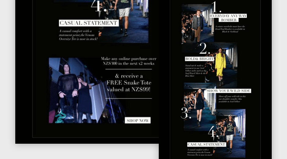
Here’s a great example of a content marketing email from Stolen Girlfriends Club, which shows that big numbers, bold headlines, and a few choice words are perfect for leading readers right to your CTA.

Create a cohesive customer experience for your store
People are understandably suspicious of email senders who don’t clearly identify themselves from the get-go. This goes beyond putting your store’s name in the “from” field and sticking your logo somewhere on a template. Subscribers should be able to immediately identify your brand from looking at an email, and know that they’re going to encounter a similar aesthetic if they click through to the page you’re driving them to.
Things like the colour scheme, image treatment, button styles, typography and tone all play into a customer's experience of your brand. If your store design is clean and minimal—white backgrounds, elegant fonts, muted images—then it would be incongruous to send an email featuring bright colours, bold typography, and high-contrast visuals. Your subscribers might not even recognize you.
Email marketing services like MailChimp and Campaign Monitor include a number of customization options in their WYSIWYG editors, but it can be tough to create a perfect match. If you're looking for a fully customized template, having a coder in your corner is a huge help. Don't know any coders? Consider using a service like Storetasker that connects Shopify experts with entrepreneurs.
Closing thoughts
The advice in this post should put you on the path to better emails, but don't take everything we say and implement it without giving it some thought. Every audience is different, and one of the best things you can do before creating your email campaign (or doing anything ecommerce-related) is to get to know your customers.
If you find that the majority of your subscribers are viewing your messages on mobile, simplifying messages and including more white space might be the ticket. If users aren't responding to conventional CTAs, you might try adding some interactivity to your emails.
Test what works best for your audience, then generate a few different designs based on those results. Good luck!
Find more helpful articles in The Ultimate Guide to Starting an Online Store.