
Single-product ecommerce: Turn your small store into a big success
It only takes one good idea to hit it big. Just ask Casper, which became a $555-million company practically overnight with a mattress-in-a-box that delivered a loud wake-up call to the entire “sleep” industry. Or Spanx, whose inventor Sara Blakely is now one of the youngest self-made female billionaires in America. Or even Crocs, which, against all odds, made a killing off of garish foam clogs.
While most retailers sell more than just one product, a massive catalog is not a prerequisite for success—especially in ecommerce. In fact, selling a single product can be an advantage. Without the distractions of building, managing, and marketing multiple products, you can focus on innovation, iteration, and making your product better than any other on the market.
In short, you can give your One Good Idea the attention it deserves.
But where to start? With single-product Shopify themes in short supply and a dearth of information about how to set up and maintain an online store with just one product, it can be tough to know what the path to success looks like.
That’s where we come in. Pixel Union's Editions, Launch, and Startup themes are three of the best-selling single-product Shopify themes. Out of the Sandbox's Responsive theme is also a popular choice for small online stores! Along the way we’ve seen what works and what doesn’t when it comes to single-product ecommerce.
In this post, we’ll cover some things you can do to turn your small store into a big success and share some inspiration from companies that have done just that.
Embrace the oversized hero trend
Larger-than-life hero images and full-screen backgrounds may be everywhere these days, but that doesn’t mean they’re a trend you can dismiss. On the contrary, oversized hero images offer up a precious opportunity to single-product stores—extra space to build your brand, highlight your promotions, and bring your flagship product to life.
But a truly “heroic” hero image is a tall order. According to Andrei Baicus from ThemeIsle, “What most people seem to miss when it comes to hero images is that they’re a double-edged sword… The best case scenario is when your image tells a story and makes the visitor a part of it. The image should never be picked randomly just because ‘I like it.’”
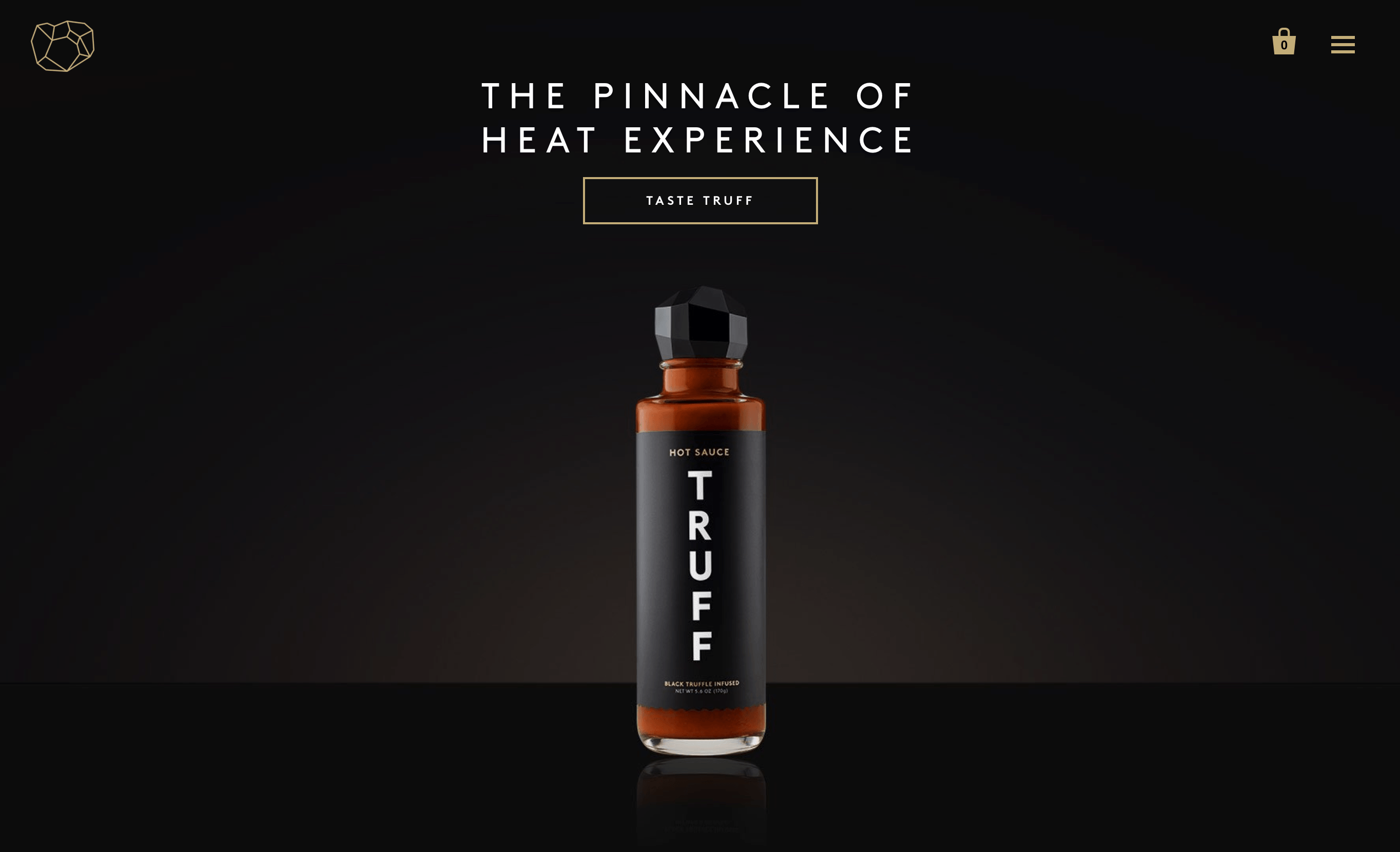
Communicating your brand or product’s story in a single, standalone image can be tough, but you don’t have to look far to find examples of companies doing it well.
Take Truff Hot Sauce (using Startup), which sells a truffle oil-infused hot sauce. Their full-screen hero displays a bottle of their signature sauce accompanied by the quote, “The pinnacle of heat experience.” This combination of crisp product photography and an enticing unique sales proposition leaves heat junkies wanting more.
From there, enter their perfectly placed call to action. Potential customers will naturally click “Taste Truff,” taking them straight to the product page—and, hopefully, the checkout.
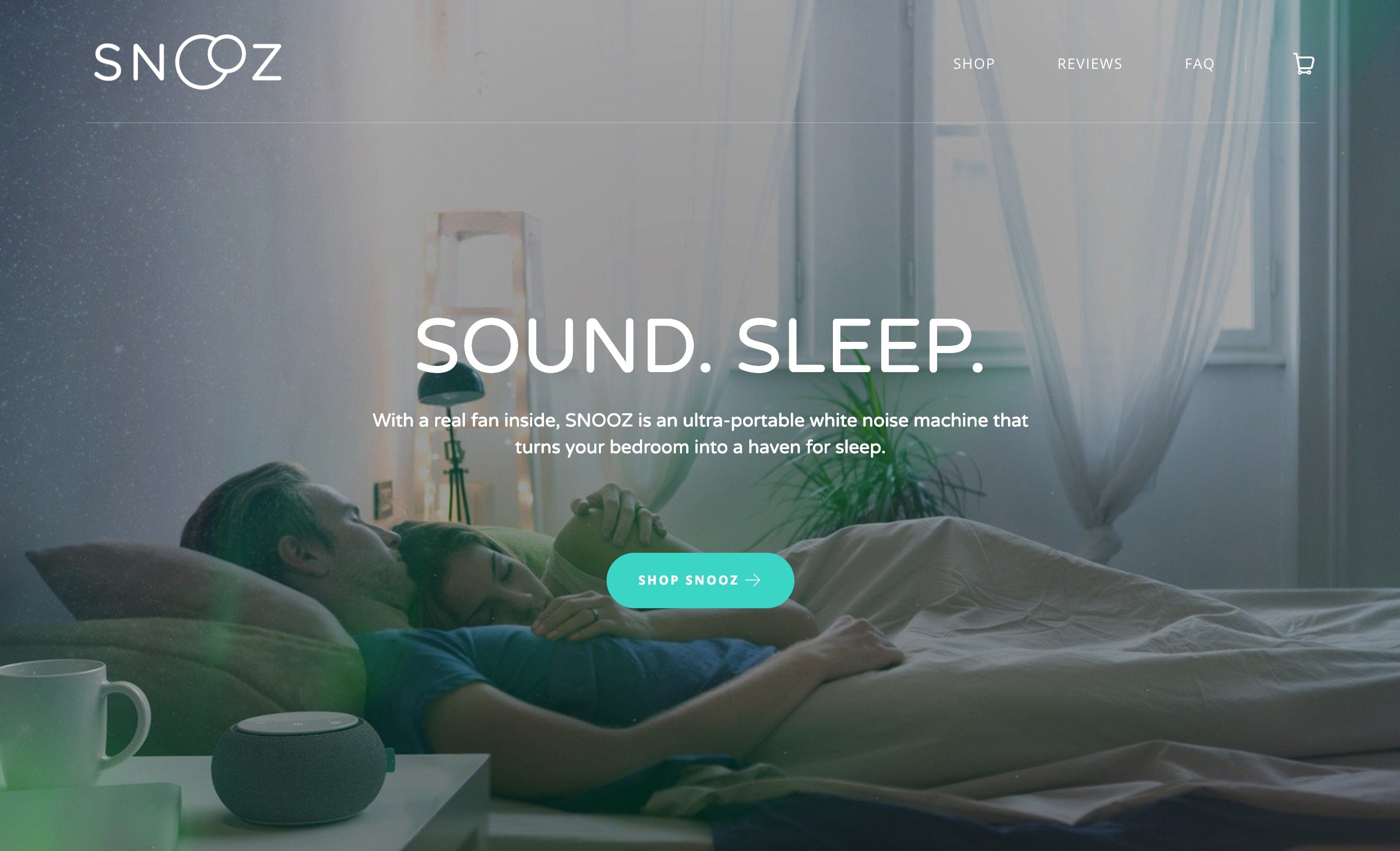
Likewise, white-noise specialist Snooz (using Launch) does a great job of explaining their product using copy (“Sound. Sleep.”—a satisfying play on words) and visuals (a couple sleeping serenely thanks to their Snooz machine). A common theme with well-designed, single-product ecommerce stores is a prominent call to action. This is an excellent tactic to get customers to the checkout—no browsing or dilly-dallying necessary.
Get creative with your homepage content
Without a ton of products taking up space on your homepage, you might wonder how to fill all that real estate. Rather than going nuts with white space, consider creative ways to convey how your product works, what its features are, and why people love it.
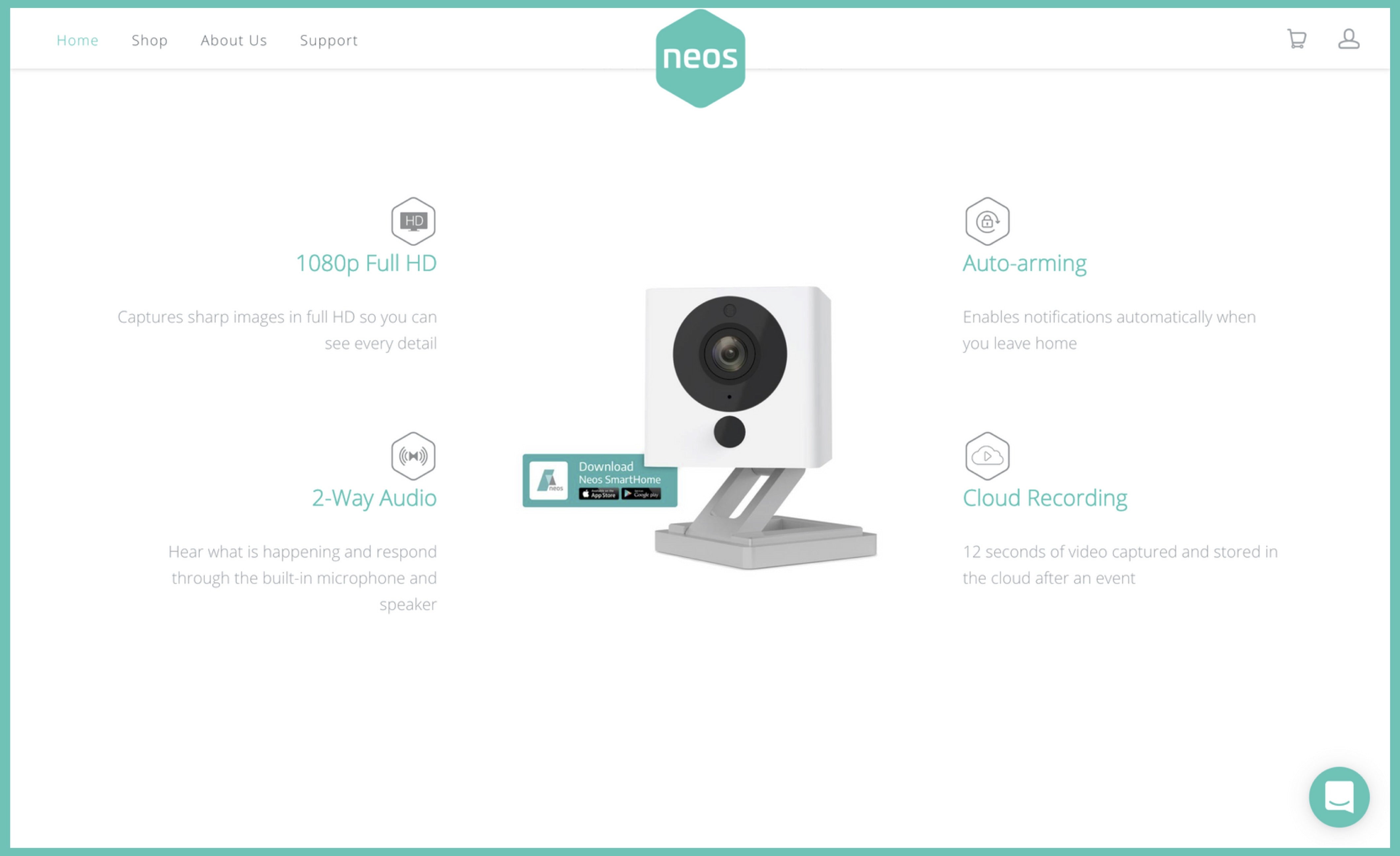
There are many ways to do this, from describing your process with icons and text to showing a gif of your product in action to calling out testimonials and press mentions.
Just look at Neos (using Launch in the screenshot above). Their home-security smart camera captures video whenever motion is detected. At a glance, customers can see the product’s features and technical specifications. This section is located below a top-notch hero image and above setup instructions and an informative video.
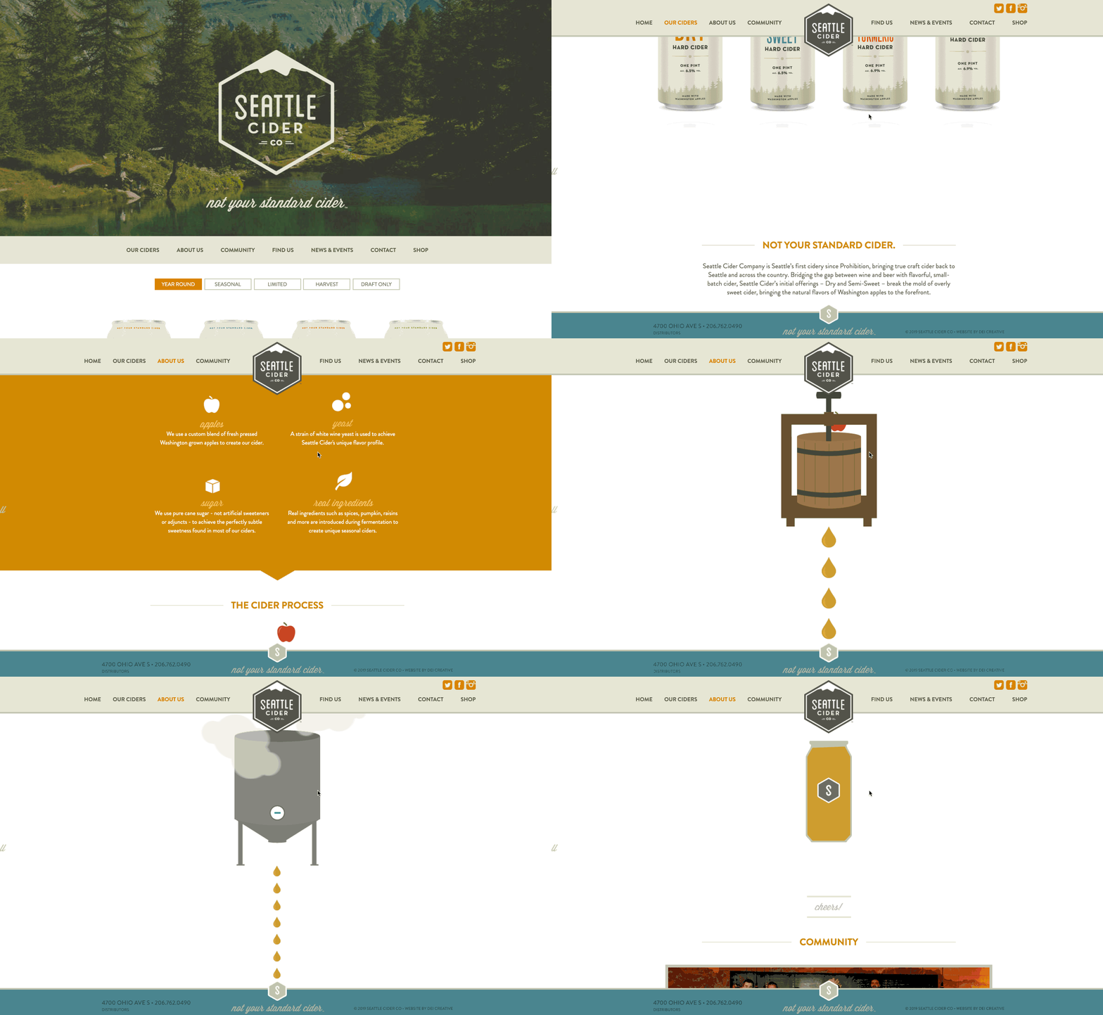
The folks at Seattle Cider Co. also do an awesome job of creating a dynamic and eye-catching homepage without relying on a heap of product images. Their homepage reads like a story, beginning with a scene-setting hero image. This is followed by a cool, interactive display of how their cider is made, finishing with an invitation to their tasting room. It’s an unexpected and enjoyable experience that doesn’t simply display the product, but explains where the ingredients come from and how they combine to make a product that is “anything but standard.”
Don’t stagnate, animate!
Producing quality product videos is expensive. For many smaller merchants, one glance at a videographer’s price tag can be enough to send them running. Standard photography and graphics will still get the job done, right?
Maybe it will and maybe it won’t. According to Forbes, viewers retain as much as 95% of a message when they watch a video, compared to just 10% when that same message is presented as text. Add in the study that 64% are more likely to buy after watching a video, and it seems like video might actually be an investment worth making—especially for single-product stores not faced with the prospect of producing dozens of videos.
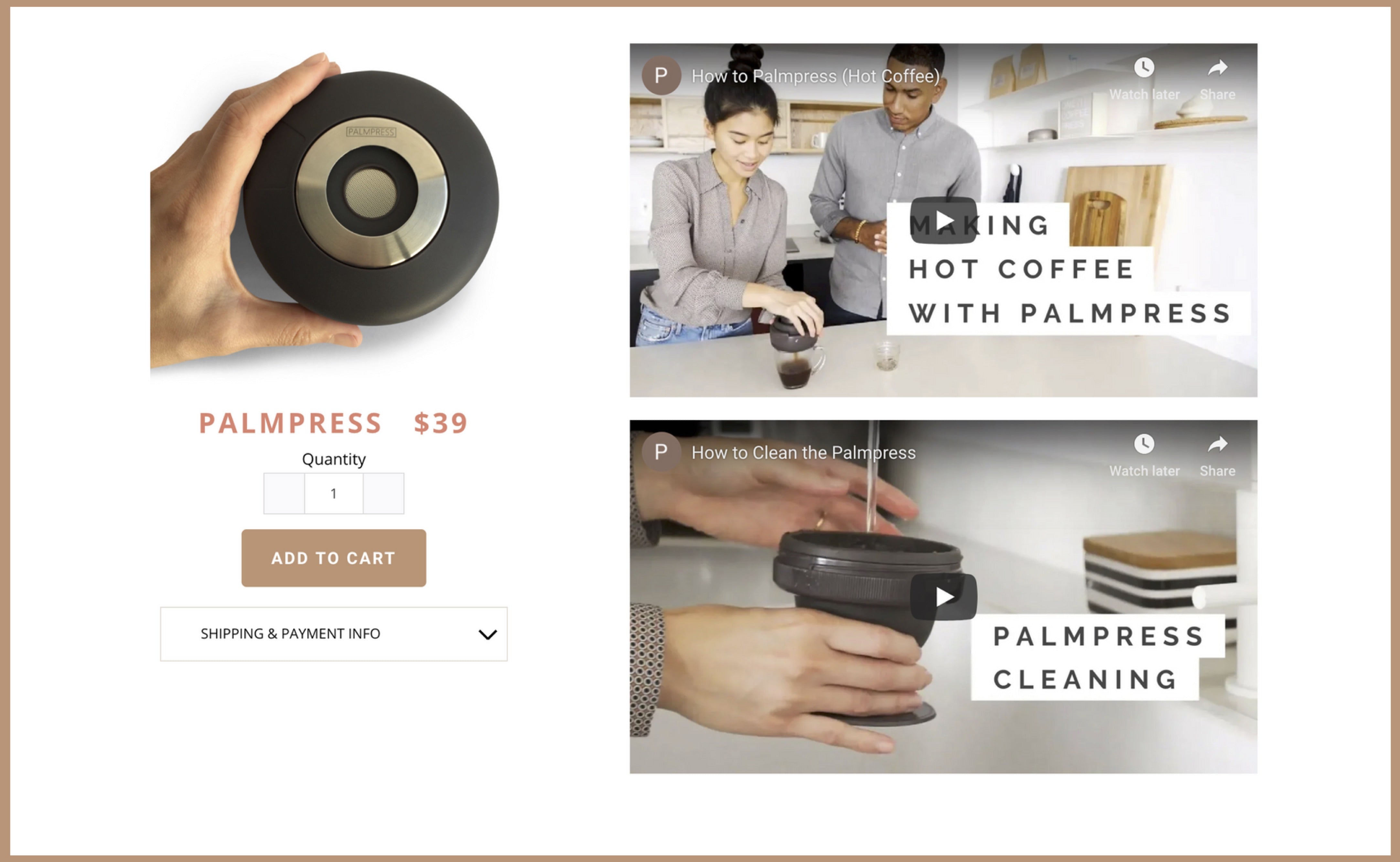
Take coffee connoisseurs Palmpress (using Startup). They use short videos on their homepage to showcase how to use and clean their unique single-cup coffee maker. Videos are especially valuable for one-of-a-kind products like theirs. Without the visual explainers, some would-be customers might think it’s just another run-of-the-mill pour over.
Palmpress uses a combination of video on their homepage. A short autoplay video plays just below the fold as customers scroll down, and it’s complemented with embedded YouTube explainers further down.
Get in on the crowdfunding craze
Soylent. Oculus rift. Exploding Kittens. You know these products, but do you know how they got their start? Crowdfunding, that’s how. Also known as asking strangers for money on the internet, the crowdfunding industry is predicted to grow to over $300 million by 2025 as more and more companies try to emulate the wild success of Kickstarter campaigns.
Crowdfunding tends to work best for single products that appeal to a specific, narrow, and passionate audience. As Shopify puts it, “Your product has to be something they can’t pick up at Walmart, and not easily found online. There has to be a community that craves your product for a problem that’s not being solved right now.”
If that describes your product, crowdfunding might be a good fit. Dedicated platforms like Kickstarter, Indiegogo and RocketHub are obvious solutions, but if you want to customize the look and feel of your store, you’re better off with Shopify. Some Shopify themes even come with built-in pre-ordering and goal-tracking features.
Do one thing well
That’s all you need: one thing. Nothing more. No distractions. No kidding yourself that you can be the master of everything. By focusing on just one product, you’ll be able to home in on the details that make it unique and interesting, without the noise of “options” and “variety” in your ear. You can focus on creative enhancements, attentive customer service, effective marketing, and you can do your one thing better than anyone else.
Start with the right theme
When you’re looking for the perfect Shopify theme for your single-product ecommerce store, take into account what you need to communicate to your customers. You’ll need to explain how your product solves a problem, show off its features, and drive customers to the product page. Simple navigation, a clear call-to-action, and great product photography and videography will be essential. All of this can be achieved with our Launch and Startup themes. The best part? As your single-product ecommerce store grows, both of these themes will scale with it.
Browse Shopify's best themes from Pixel Union and Out of the Sandbox to find the perfect fit for your online store.
Find more helpful articles in The ultimate guide to starting an online store.