9 Shopify theme features that every clothing store needs
This article was originally posted on the Storetasker Blog.
It’s not news that the experience of your online store can make or break a sale, but in today’s competitive market, pretty images and marketing aren’t enough to set your clothing store apart.
In this post, we’ll cover some modern features available in cutting-edge Shopify themes that will not only elevate the overall look of your store, but will actually help your customers understand your product value faster, find crucial information easier, and get to the checkout more smoothly (ideally with a few extra things in their cart).
Make your aspirational looks attainable
Lifestyle imagery is a huge part of apparel merchandising as it not only showcases how your products look on a person, but it also sells an aesthetic that your customers can buy into when they purchase your product.
You can now use lifestyle imagery to do more than just inspire thanks to some exciting new features available in certain Shopify themes.
1. Shop the look
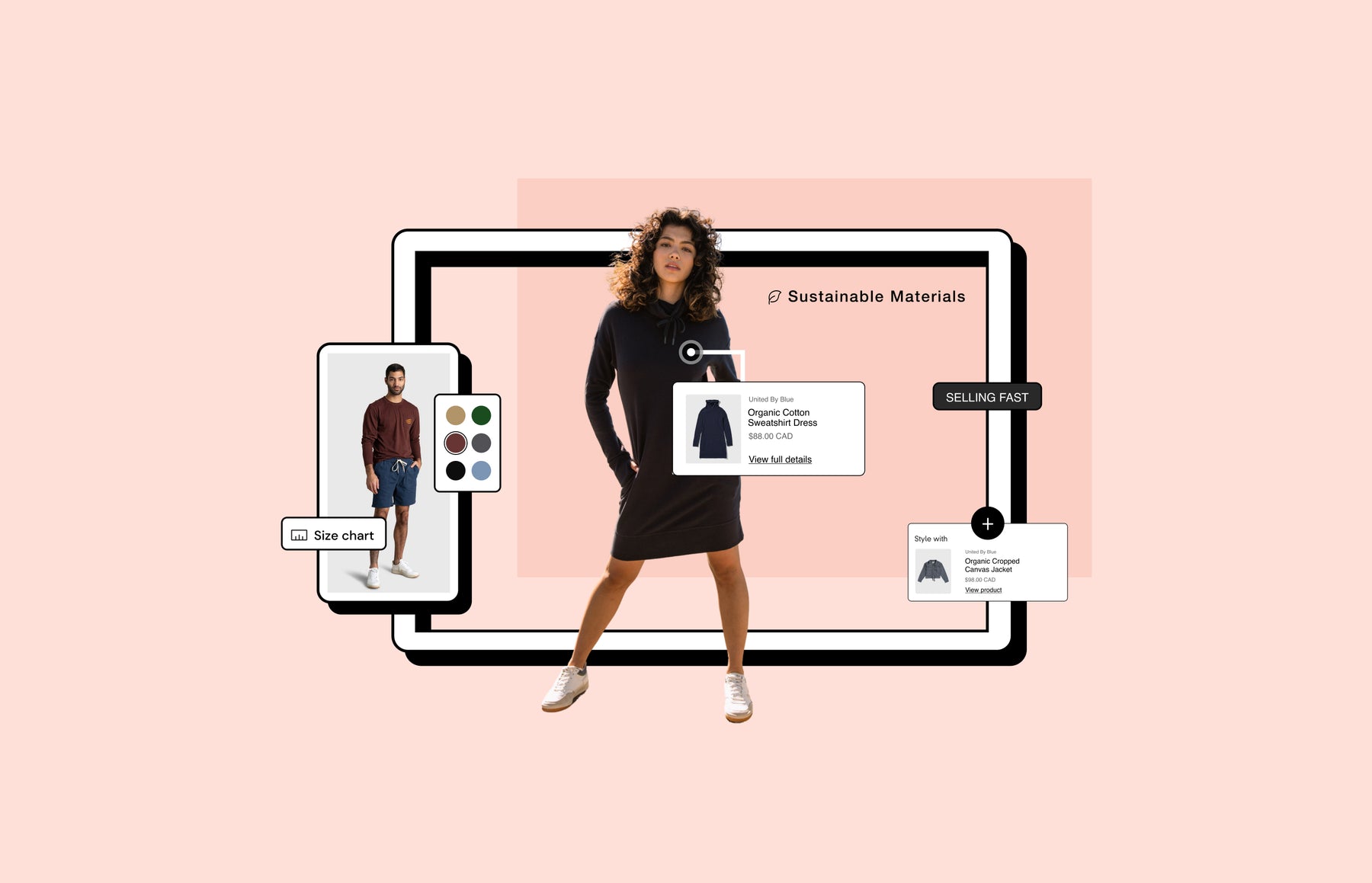
Shoppable images, or shop the look functionality, allows your customers to interact with your lifestyle imagery by surfacing product information when someone clicks on the products shown. This way, when a shopper is inspired by a look, they’re able to quickly find the featured products without any extra searching. Tailor can even build carts around the products featured in shoppable images. Capturing browsers when they’re inspired is a super effective way to convert them into paying customers.
You can find the shop the look feature in Pixel Union’s newest Shopify theme for clothing stores, Tailor, as well as in our best-selling theme, Empire.

The Tailor theme
Call out the details customers care about
By focusing on what makes your product different, you can increase its value in the eyes of your target customer. Whether it is sustainability, a performance feature, material composition, or place of origin, hooks like these will grab your customers’ attention and make it clear why your product is special.
2. Product badges
A small but powerful tool, product badges and labels are one of the fastest ways to communicate your product’s special features to your customers. Calling out unique selling propositions (like “New” or “Organic”) by adding badges to product cards will make those products stand out among the rest, and quickly communicate each products’ value to shoppers. On the product page, badges are easy-to-register and encourage browsers to dive deeper into the product’s details.
Pixel Union’s theme Tailor does this especially well by allowing you to create your own custom badges and labels and include them on product cards and pages.

Custom badges on the Tailor theme
3. Product swatches
Product swatches are a feature every online clothing store should have. They enable your customers to explore the available color or pattern variants of each product without needing to scroll through your entire product list. Color swatches also communicate what each variant will look like much better than simply listing the variants by name — after all, one person’s interpretation of “blue” will likely differ from another’s, and in the world of e-commerce, the goal is to communicate your products’ features as quickly and as accurately as possible.
If your current theme doesn’t support swatches, it’s time to consider switching to one of the many themes that do support this feature, like Tailor or Empire.
Looking for a supplier?
Trendsi is your one-stop fashion supplier that provides fashion dropshipping, open pack wholesale and made to order services.
Elevate your fashion business with agile inventory management, hassle-free fulfillment, and a commitment to superior product quality.
4. Visual storytelling
There are two places on your store that your shoppers are most likely to look at first: your hero image and your store’s mega menu. It’s important the imagery here is high-impact and motivates shoppers to browse your catalog further.
Hero images that are large, bold, and have a customizable text overlay (never text-on-image) are most likely to catch shoppers’ attention. It’s a bonus if your hero image section is also customizable enough to show off multiple images, different text alignments, and combine text, image, and color blocking so you can create a look that’s unique to your branding.
 Text-on-images
But visual impact shouldn’t stop at just hero images. Your store’s mega-menu can — and should! — also feature eye-catching promotional imagery that shows off your product’s details and/or conveys your brand’s aesthetic.
 Mega menu
Make shopping easy
Once a customer is on your site, you want to offer them the information they need to make a decision quickly. Here’s how you can do that.
5. Popup size charts
Size charts offer information that many shoppers need before they’ll buy a piece of clothing online. If you display your size chart as a popup feature right on the product page, you’re more likely to keep that customer on the path to making a purchase. You can find this feature on Pixel Union’s Tailor and Atlantic themes.
 Size chart in Tailor
6. Quick add
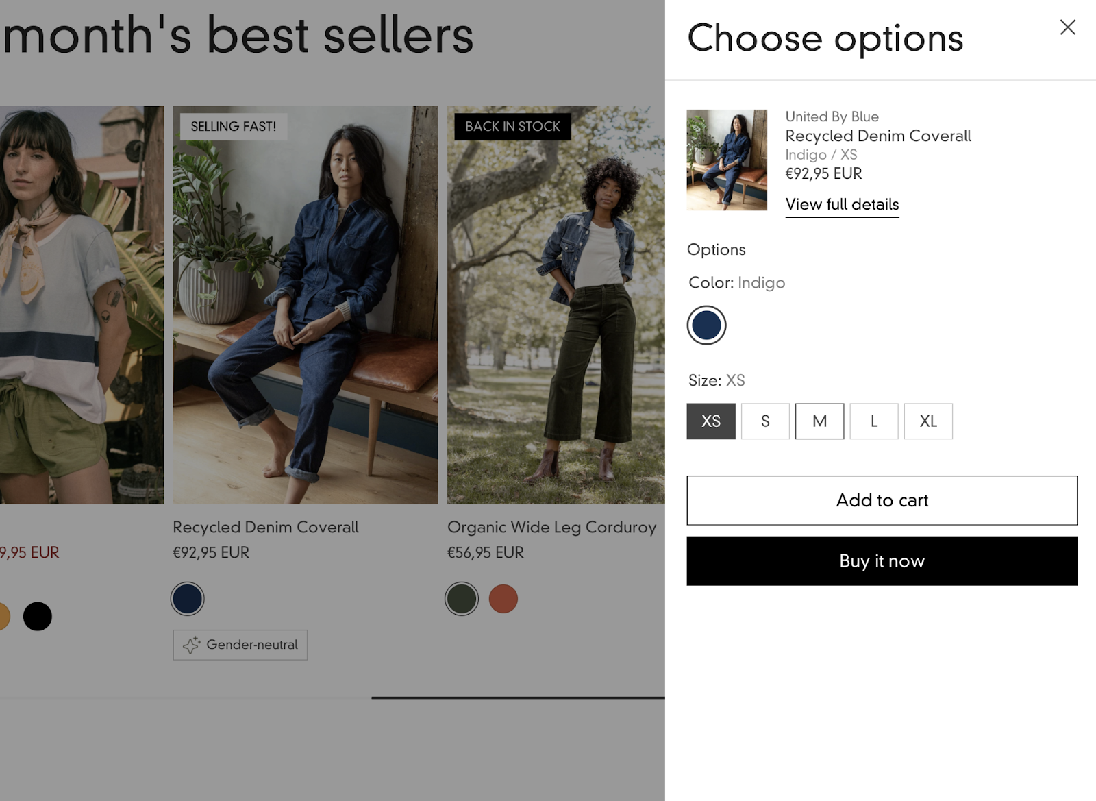
As your customers scroll through your product grid, they’ll likely find something that intrigues them. Convert that intrigue into a purchase by setting up quick add functionality, where shoppers can learn more about the product and then add it to their cart without losing their scrolling momentum.
Quick add is the more modern and stylish cousin of the quick shop function that most Shopify themes have, and it’s included in both the Empire and Tailor themes.

Quick Add functionality
7. Product page image layout
Instead of making shoppers click through your product photography while on a product page, give your customers all the visual details up front with either a grid or single column imagery layout. This feature shows all of your images for a product in an expanded view that both looks great and helps shoppers make decisions faster.
The single-column layout is available in Out of the Sandbox’s Flex theme and Pixel Union’s Vogue theme, while the Tailor theme supports both the grid and single-column view.
 Product page layout
Don’t leave money on the table
Customers can’t buy a product if they don’t know it exists. Strategically placed product education converts browsers into buyers, with more products added to their cart and a higher average order value for you.
8. Upsell blocks
Upsell blocks show customers similar products that go with the product they’re currently viewing. It’s a concept that’s been around for ages, but new Shopify themes like Tailor are modernizing it by allowing you to set the feature up where you like on product pages, either in an expanded view or as a sleek accordion-style tab.
Another way to add upsell functionality to your store is by using an app like Orbit’s Ultimate Special Offers, which helps you create post-purchase upsell touchpoints.
 Product upsell blocks
9. In-cart product recommendations
Harness the power of social proof and create buzz around your products by recommending items that customers are currently buying or have recently bought.
You can do this either by utilizing upsell features on your product pages, or by setting up a cross-sell opportunity directly in the shopping cart. By providing suggestions based on other customers’ purchases, you’re not only providing product education but you’re also creating a personalized shopping experience.
Find this feature built into the Tailor theme.

In-cart Product Reccomendations on Tailor