How to design large, full-width hero images for landing pages
The oversized, full-width hero image on a store landing page is everywhere these days. And it makes sense, doesn't it? Not only does this site-spanning, larger-than-life image appeal to our visual sensibilities, but done right, it can be a powerful way to establish a brand, highlight promotions, and bring products to life.
In this post, we’ll discuss the power of hero images, break down the components of a good one, and give you some practical tips and techniques for creating beautiful and compelling hero images for your online store.
What a good hero image can do
Although there are many things you can do with your homepage, the true power of hero images is that they impose limitations. They allow you to grab the attention of your customers by forcing you to convey one single idea really well.
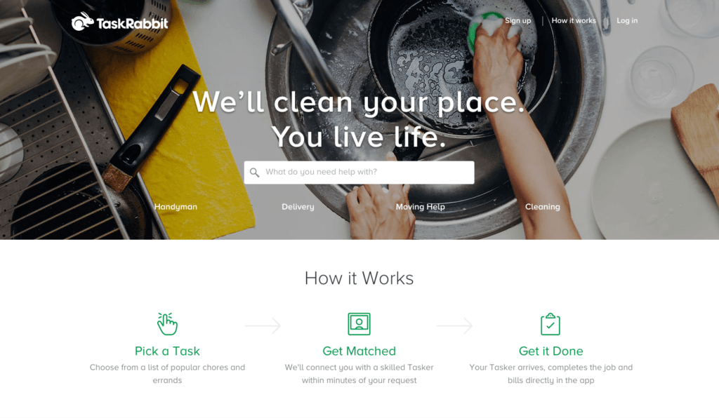
Task Rabbit wants one thing: for you to tell them what you need help with.
Unlike rotating image carousels and multi-image homepage layouts—which allow stores multiple opportunities to capture visitors’ attention and get a point across—with a hero image, you get just one. According to the Nielsen Norman Group, this forces ecommerce merchants and designers to be more thoughtful about their image choices: “If designers knew they had to choose just one image and a sentiment for it, they may be more likely to choose something that’s powerful and demonstrative.”
So if you only get one kick at the can, what do you prioritize? Is it more important to educate visitors about your company ethos, or to let them know you’re having a sale? Ultimately, that will depend on your business and your customers, but if you ask us, one of the most powerful uses of the hero area is highlighting your brand’s unique selling point. That is to say, why should your customers care about your business?

RideTap's headline insinuates that the “transportation ecosystem” can be a fragmented and disorienting place. It positions the app as a simple, accessible alternative “just a tap away."
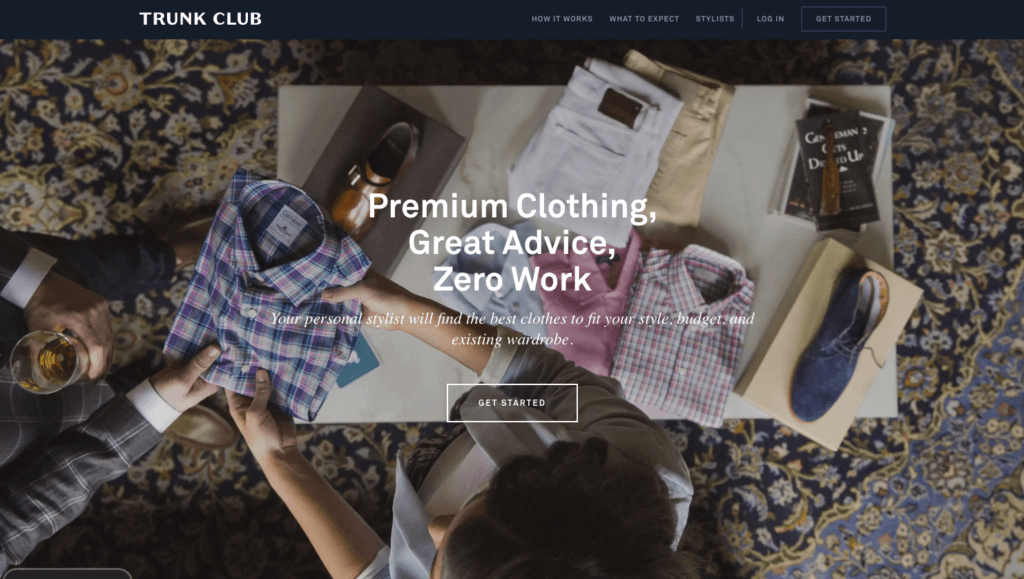
Trunk Club does a great job of communicating their three-pronged value proposition in their headline, while their hero image conveys the type and quality of service they offer.
What should a hero image include?
At its core a successful hero area combines three elements: a striking and high-quality image, concise copy, and a call-to-action.
Image
Customers love big, beautiful images that provide context. Your hero can include anything from lookbook photography to illustrated artwork to video, but if it’s “just pretty,” it isn’t going to resonate. Instead, choose something meaningful that says something about who your brand is and the experience you want your customers to have.
If you're stuck for ideas or don't want to pay for a photographer, stock images are a great option. By using a reputable site like Shutterstock, you can find high-quality images that fit your branding for a fraction of the price it would cost you to create original content.
In fact, here's a coupon code for ten free images to get you started.
Of course, no one’s saying you have to use stock photography for your hero images. If you have the time and the budget, shooting your own images is definitely worth considering. You might be surprised at how easily and inexpensively it can be done.
Whatever hero image you choose, it's important to remember that it will display differently depending on what size screen it's being viewed on. Be sure to choose an image where the focus is in the center, to ensure the most important part of the image is always visible.
Copy
“Show, don’t tell” is good policy when it comes to selecting a hero image (among many other things), but there are some things you just can’t convey with a single, static image. That’s where copy comes in.
The headline on your hero image will be the first and sometimes only words a visitor reads on your site. Your goal with hero copy is to communicate your store's value in as few words as possible and to get the visitor to engage. Write out possible headlines until you hone in on the perfect one. Take the time to get it right.
When it comes to displaying copy on a Hero image, it’s best to avoid using images with embedded text, or text that is part of the image itself. Embedded text can give mixed results on different devices, as responsive images will resize depending on what size screen they're being viewed on. Embedded text might be cut off if the full image doesn’t display across all devices. We recommend instead using the text input fields found in Shopify's theme editor for our themes.
If it's absolutely necessary to have embedded text, make sure it's in the center of your hero image so there is more of a chance that it will be visible across all screen sizes.
Call to action
Your hero image can (and usually does) include a call to action. That is, the action you want your visitor to take, generally by clicking a button to learn more, shop, or subscribe.
There’s no definitive answer for which phrase, colour, or size will work best in each online store, but keeping things simple, bold, and “above the fold” have all been proven to increase conversions. It’s also crucial that you test and optimize your calls to action to make sure they’re working as hard as possible.
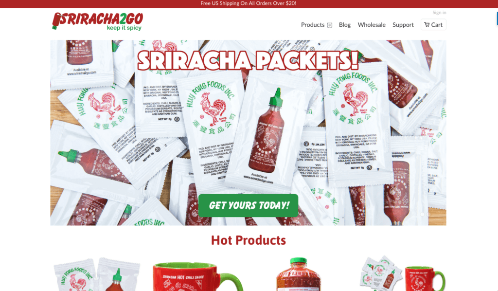
No Sriracha fan could say no to this rousing Sriracha2Go CTA.
Finding the perfect font
Getting the headline and copy right is incredibly important in hero design, but just as important is the font used.
The right font can go a long way toward capturing peoples' attention and marrying your hero image to your store's branding. The wrong one can obscure and distract from everything else on the page.
Here are some of our favourite resources for finding the perfect font:
- Google Fonts - Once a tangled repository of every open-source font on the web, Google has recently refreshed its user interface and is focusing more on curation and quality. You can filter by categories like Sans Serif and Handwriting, sort through recent and trending fonts, and toggle between different degrees of thickness, slant and width.
- Typewolf - Pairing fonts isn’t easy, but Typewolf makes it easier by highlighting attractive, workable couplings on its gallery homepage. It’s also got some super helpful font recommendations, lists and collections, including "Top 10 1970s Album Cover Fonts" and "Top 10 Most Popular Humanist Sans-Serifs."
- Font Squirrel - With more than 264 fonts ranging from blocky to calligraphic to retro, Font Squirrel is a great spot to snag high-quality free web fonts. It also has a new font identification tool—Font Matcherator—so if you see something you like and want to replicate it, you’re in luck.
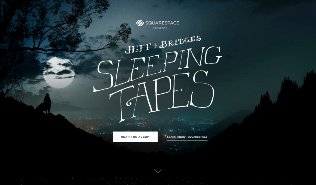
Can’t find the perfect font? Make your own! Squarespace's designers hand-crafted type for the hero area of Jeff Bridges' Sleeping Tapes—the perfect fit for the site's mysterious, slightly creepy vibe.
Pulling it all together
At this point you’ve got your image, your copy, your font, and your call to action. Now it’s time to pull it all together with a unified, beautiful hero section. Many store owners use Photoshop to accomplish this, but there are also several user-friendly alternatives, like Canva, that are geared towards non-designers.
Last word
While it’s easy to dismiss oversized hero images and backgrounds as fleeting trends, when done well, they have the potential to pack a punch and add a ton of value for your customers. Prominent, compelling, and aesthetically pleasing, they can help a visitor understand very quickly what your value proposition is—a feat for even the most seasoned of store owners.
Find more helpful articles in The ultimate guide to starting an online store.