9 tips for creating product photography that sells
There's no way around it: images are the best way to showcase a product. 93% of consumers cite images as a major consideration when making a purchasing decision online. And, over half of customers will leave a website if they don’t like how it looks. Ultimately, your product photos directly impact your conversion rates.
Understanding how important high-quality product photos are for your online store, we’ve put together nine tips for improving your store’s product photography.
Remember that product photos are an investment
Throughout this journey, you need to keep in mind that good product photos are in the best interest of your business—a way to increase conversions. Product photos are an investment. Whether you hire someone to take and create images for you or go the DIY route and have to learn some new skills, you will be investing money, time, or both. Remember that this is a worthwhile investment—something you absolutely need.
Plan, plan, plan
Planning your product photos is one of the most valuable things you can do when starting this process. Ask yourself what your images need to look like to fit with your brand, and plan the images accordingly.
If you’re taking the photos yourself, planning will help out future you and keep you on track. If you’re hiring someone else to take your photos, having an idea of what you want will help you communicate to your photographer.
With such an important investment, you don’t want to waste time and money by just “winging it.” You want to do it once, and do it right.
Decide if you’re taking product-only photos, lifestyle photos, or both
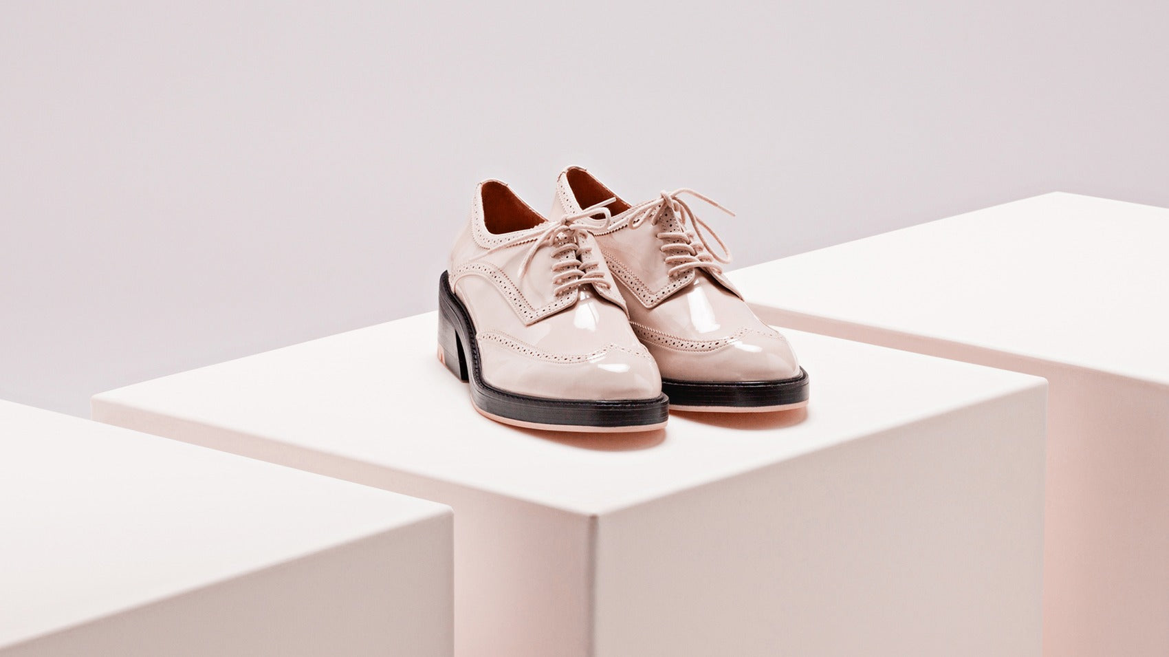
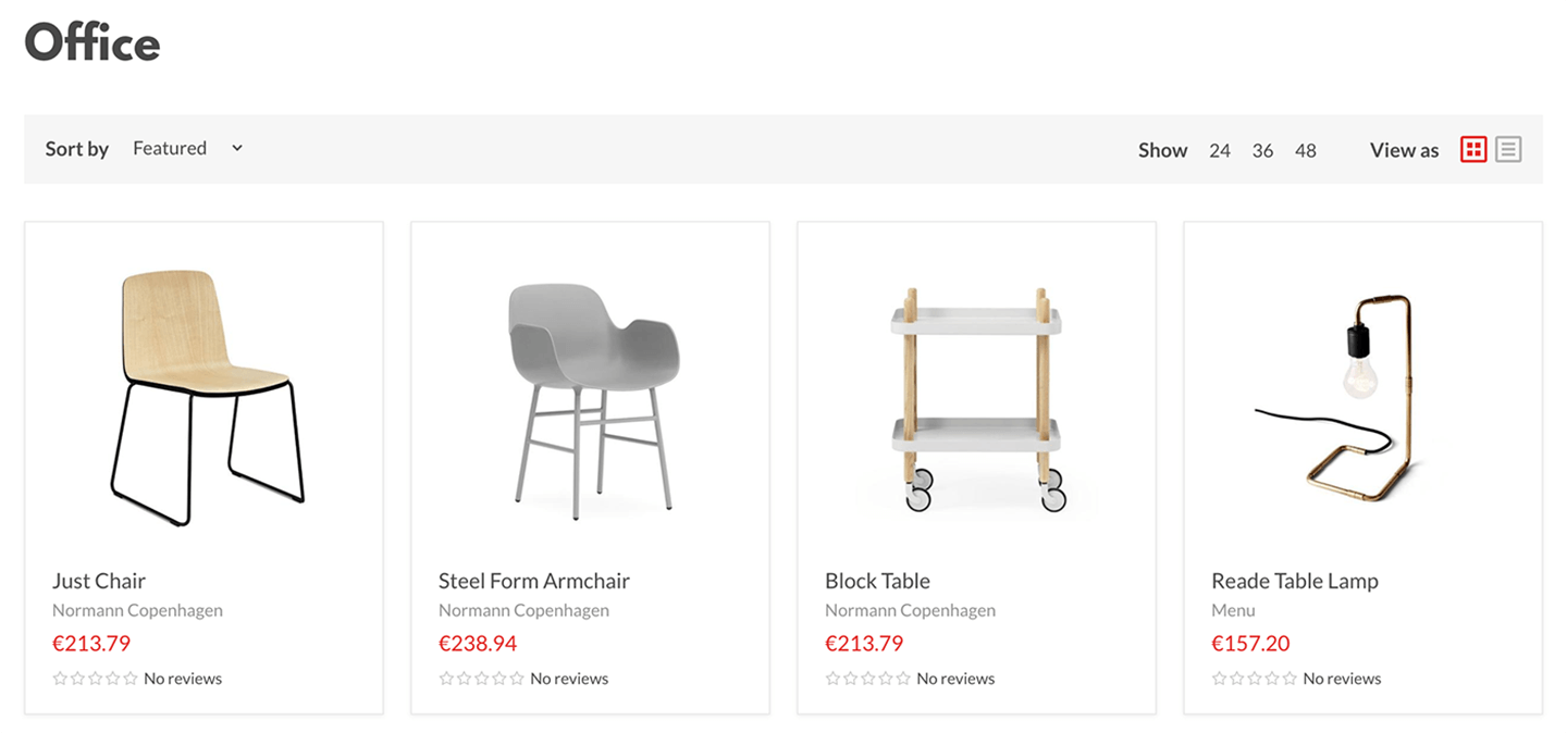
Product-only photos are the most common in ecommerce stores. They’re usually clean-cut and taken from multiple angles on a neutral (usually white) background. These photos show off your product in a simple and straightforward way. If you sell your products on a large marketplace such as eBay or Amazon, you’ll need this type of photo.

Our Empire Shopify theme demos show product photos in a nice, neutral way.
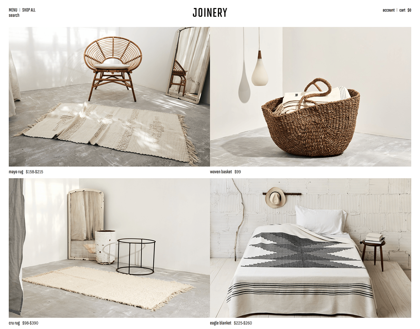
Lifestyle or contextualized product photos show your products in action by featuring the product alongside complementary subjects. This type of photo lets shoppers imagine themselves with your products. Lifestyle images allow for more creativity than product-only shots, and, therefore, are ideal for sharing via social media, blog posts, or email.

Joinery uses beautiful lifestyle product photos on their website.
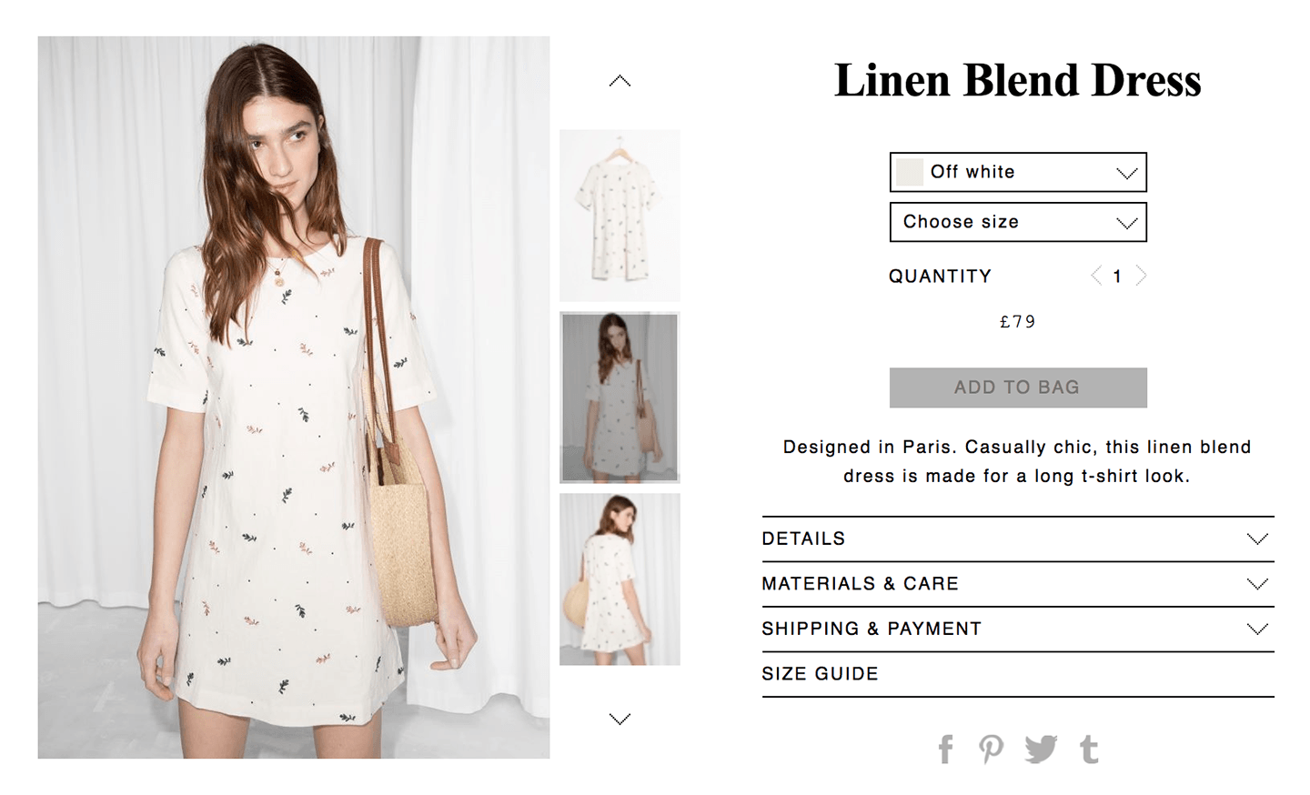
And what if you want to combine product-only shots and lifestyle photos? Go for it! Do whatever you think will show off your products best. A ton of businesses use a combination of the two. Whatever you’re doing, just make sure it’s in the service of your product and stays visually cohesive with your brand.

& Other Stories combines realistic lifestyle images with a single studio shot.
Lighting is key
Photography literally means drawing with light, so it’s safe to assume that lighting is super important. Lighting is key to creating a successful product image. It determines darkness and brightness and establishes the tone, atmosphere, and mood of a photograph. To highlight the textures, colours, and luminosity of the image’s subject (your product) you need to be conscious of and able to manipulate lighting accordingly.
You don’t need an expensive camera
Consider the next few tips if you’re taking the DIY route for your product photography.
If you can’t afford to buy a high-end camera, or if you’re not going to get much use out of it, don’t buy one. Borrow a high-quality camera from a friend or pick up a more affordable option. A lot of less-expensive cameras on the market today can get you the quality of image that you need without the high price. You may even be carrying it around in your pocket already (hint: it’s your phone).
Essentially, you just need a camera that takes photos that are high resolution enough that they won’t look fuzzy or blurry on larger screens. You’ll also want your camera to have exposure control, so you can manipulate lighting. Newer smartphones have this.
Use a tripod
It doesn’t matter if you’re using a Nikon D5 or your iPhone 7, a tripod will change your life. Not only will it stabilize your camera if you’ve had a little too much coffee, it lets you take photos from the exact same angles with the same lighting (and therefore the same shadows) for multiple images and products. Amazon has a ton of affordable tripods for any type of camera or smartphone.
Shoot loose and let your products breathe
Someone once told me to “shoot loose.” What they meant was to make sure when you’re taking the photo that you’re not too tight on the subject (your product). If you don’t include any background, it’ll be hard to change the size or orientation of the image to fit with your website, social media, or other promotional material.
As a rule of thumb, your product itself should take up approximately 65-70% of the photo. Without space around the product, photos feel claustrophobic. On the other hand, you don’t want your image to have more background than product. If your product is too small in the photo, your customer won’t be able to see it.
Don’t be afraid of editing
Contrary to “outraged” social media users, Photoshop (and other photo editing tools) aren’t a bad thing. Maybe you want to get rid of a nasty shadow or make your background colour the same tone of white.
Photo editing is an important step in making sure your images are consistent and all of your product photos are cohesive. There are so many things you can do to improve or correct an image. Most computers or cameras come with free editing software. Even Photoshop can be affordable with a subscription. The trick with any editing tool is to do your research beforehand. There are so many YouTube tutorials and online editing guides that if you invest some time in learning, you’ll be able to edit photos in no time.
Never delete your original photos just in case something goes wrong. And never over-edit your photos. Your customer still needs to see what your product looks like. They don’t care what your blender would look like if it were painted by Van Gogh.
Be consistent
I’ve mentioned this throughout, but it’s so dang important that I’ve also made it a standalone tip. Everything you do for your store, whether that’s sending an email, tweeting a tweet, or taking a product photo, needs to be in service of building and strengthening your brand.
For the purposes of this post, we’re talking about the look and feel of your online store. You know, or you should know, what your branding looks like. So, if you’re a skincare company that makes natural products and uses mostly pastel and neutral colours, you’ll want to avoid taking heavy or overexposed images.
Every step of the way, consider how each image will work with the other images you’ve taken and the overall vibe of your website.
Uploading your images
When it comes to uploading product photos, Shopify recommends the following specifications:- Image Format: JPEG
- Colorspace: sRGB (anything on the web must have this color space set)
- Resize to fit: Width and height – match your crop size
- Resolution: 72 pixels per inch (this is a standard screen resolution)
We also recommend that you include alt text for every image you upload. This helps with your SEO and accessibility.
Bonus tips!
- If your website’s background is white, opt for another (probably neutral) colour instead. This way, your products aren’t drowning in a sea of white.
- Scale your images—to an extent. A pair of earrings on your product page shouldn’t be the same size as a bookshelf. Keep it somewhat realistic, but still, make sure your products are visible and accessible to consumers.
- For more information on the specifics of taking your own product photos, Shopify has an excellent DIY resource.
Find more helpful articles in The ultimate guide to starting an online store.