How to pick a Shopify theme that's right for your store
It’s never been easier or more lucrative to start an online store. Choose a niche, organize your inventory, a few clicks here, maybe a new Instagram account there, and boom! Your online store is open for business.
Still, there’s a big difference between an operational store and a thriving store. Look no further than the 11.4 million ecommerce sites currently selling less than $1,000 per year—and the 1,000 stores pulling in more than $10 million. When it comes to ecommerce, Pareto’s 80-20 principle has been jacked up to the extreme.
So what is it that separates the best from the rest? How do you get your store into that rarified big-seller air? Acquiring customers faster, upping your average order value, and fostering brand loyalty are all great objectives for established stores, but for new merchants the best thing you can do right now is pick a theme that’s right for your store.

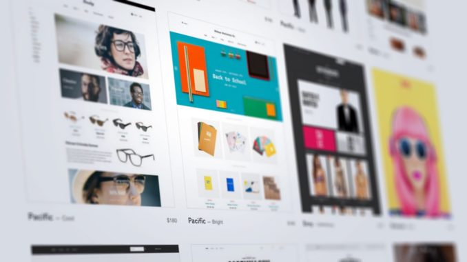
If you’re using Shopify (and considering it’s the world’s top-rated and fastest-growing ecommerce platform, why wouldn't you be?), one of the first steps you’ll take is choosing a theme. Among Shopify’s many draws is the quality of its themes, with a rigorous submission process that ensures only the very best make it into their Theme Store. This process narrows the field considerably, but it still leaves over 100 free and premium options. Unless you’ve got a few days to check out demos and compare features, you’re going to need some criteria.
Step 1: Nail down your top three features
Before you even begin to browse themes, you should draw up a list of must-have features—and no, “awesome aesthetics” is not a feature. We love shiny, pretty things as much as the next design shop, but flash-over-function is something we would never endorse. Don't be swayed by beautiful typography and demo images you don’t own and can’t use.
Instead, give some thought to the functionality you’ll need, whether it’s a mega-navigation menu, frontpage slideshow, image-zoom tool, or something else. Try to prioritize your top three.
With your list in hand, you can move on to reviewing themes and making a shortlist of those that offer your desired features. Only after you’ve whittled down your options to the ones that meet your needs (functionality) should you start thinking about your wants (aesthetics).
Step 2: Settle on a budget
Shopify theme prices vary widely, from free to almost $200. If you’re small and working on a shoestring budget, the Theme Store currently offers 21 options that can get you up and running for free. (We happen to have a special place in our hearts for New Standard).
But like so much in life, you get what you pay for. That’s not to say there’s anything wrong with free themes (everything in the Theme Store has made it through Shopify’s strict approval process), but if you can afford it, you’re much better off with a premium theme.

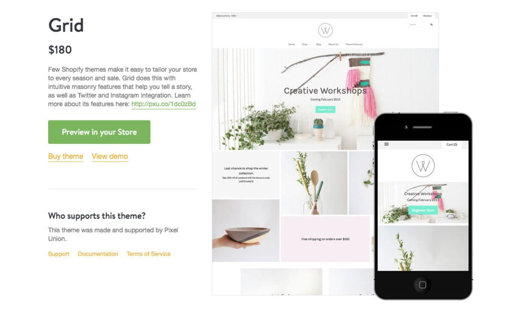
Premium Shopify themes cost around $140 to $180 and typically offer more functionality than free themes. That means there’s a greater chance of finding something that checks all the boxes on your “must-have” list.
Premium themes also have the advantage of being more flexible, more professional-looking, and less widely-used (which is important if you don’t want to look like every other shop on the block). Usually, they make it easier for your customers to search, browse, and buy. In other words, they help you convert better and sell more products.
Step 3: Choose some featured images
While functionality is undoubtedly the most important factor in how customers use your store, there's no denying that first impressions count. There’s a big reason why most themes and online stores have a large, featured image or series of images prominently displayed on the homepage: imagery is important. With customers making judgments in 1/10th of a second, you should lead with your best content—and your best content is always an image (or some kind of moving image, like a video, if you have the resources for that).
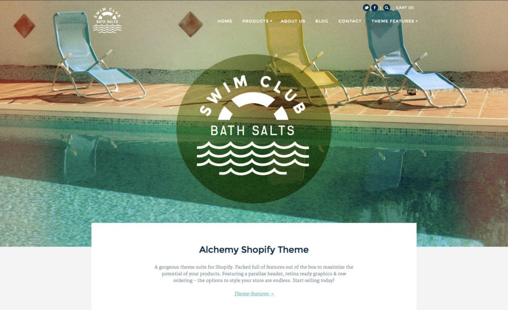
Think about what images you plan on using in these hero, banner or carousel areas. You’ll always have the option of changing things later on, but as you review your shortlisted candidates, consider whether or not your images match the style and tone of the theme. (Having said that, if you want a good example of how different images can transform a theme, take a look at these four very diverse presets.)
Step 4: Consider how many products you’ll sell
Something else you’ll notice on a trip to the Theme Store is that different themes are geared toward different catalogue sizes. A store with a fairly limited catalogue of 10 products requires much simpler navigation than a store with 100 or even 1,000 products.

If you’re selling a single product (say, a book, a digital download, or some kind of tiny tech innovation), it's probably a good idea to present everything on your homepage. But if you have more than about five products, you’re better off with a theme that allows you to feature a small selection on your homepage and place the rest on a separate, attractively-arranged product page.
Step 5: Get to know your developer
By now, you should be well on your way to picking the right Shopify theme for your store, but we have one more piece of advice: when buying a theme—from the Shopify marketplace or anywhere else—pay attention to the reputation of the developer.
Not all themes are created equal. Sticking to well-rated themes from respected developers helps ensure that your theme works as intended. Double-check that the support offered is consistent and top-notch for those rare occasions when something fails. It may not be the most exciting part of shopping for themes, but it’s an important one.
